Six Beautiful Ways to Break the Rules of Color Styling in Your Home
We can’t all be as daring as Breaking Bad’s Marie Schrader, whose love for purple ran so deep that she covered her entire home in the color. We can, however, choose to emulate her boldness by saying “no” to rigid color rules. Here are six revised rules, paired with homes where the interior design color ideas pop with playfulness.
1. Not every color has to match.
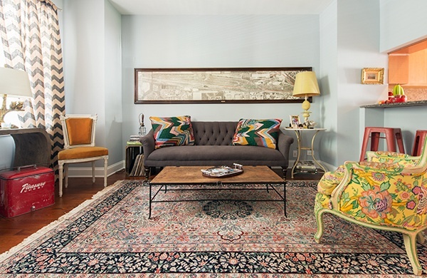
Seen in: Pie-shop owner Michael Ciapciak’s Logan Square home
The design element: Mismatched textiles
Why it works: There are four main pieces drawing your eye here—the curtains, the rug, the throw pillows, and the floral chair—all with very different prints and color stories. But because the curtains and the rug have softer hues, the overall effect doesn’t overwhelm the eye.
2. If you do you want to go matchy-matchy, you don’t have to stick with one hue.
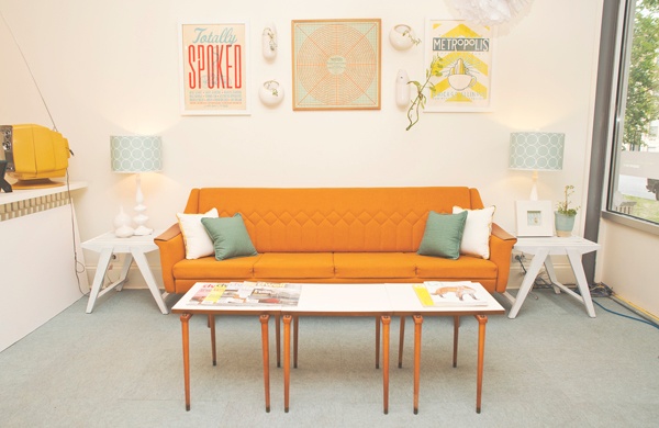
Seen in: DesignScout’s Ravenswood studio
The design element: 2–3 repeating accent colors
Why it works: With crisp white as a backdrop, multiple accent colors stand out even more. DesignScout founder Scout Driscoll—who’s worked with everyone from Metropolis Coffee to Kanye West—favored yellow, turquoise, and pumpkin for this seating area.
3. White doesn't have to be boring.
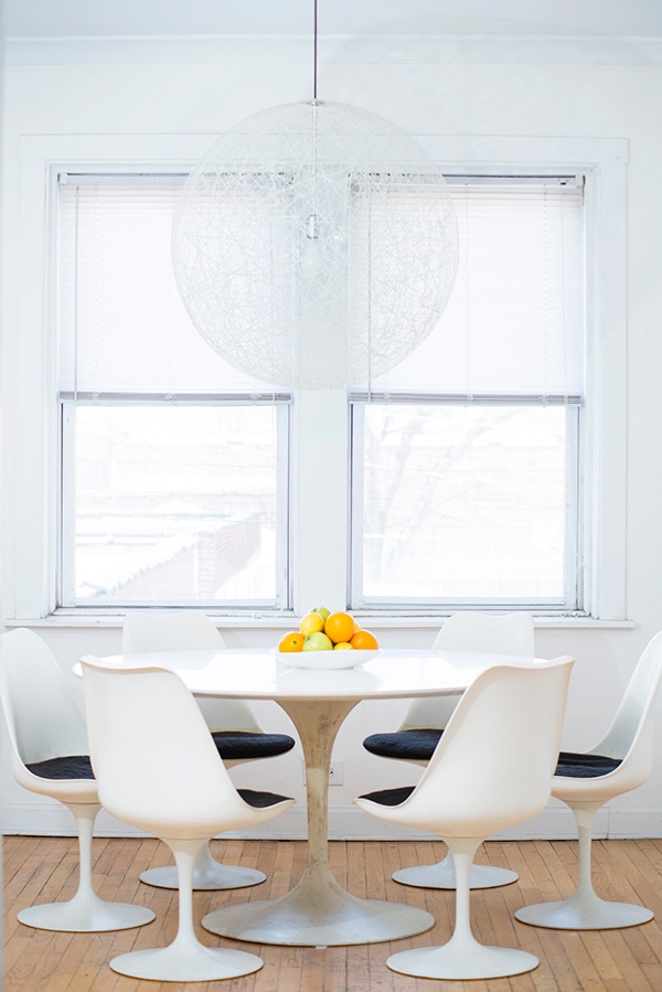
Seen in: English teacher Nick Roux’s Lincoln Square apartment
The design element: Floor-to-ceiling white
Why it works: White can be very striking, especially if you’re blessed with a home that’s flooded with natural light. Nick embraced an austere vibe by forgoing window dressing or floor coverings, and using fresh fruit (in a white bowl, of course) for a small burst of color.
4. Your appliances can be in on the fun.
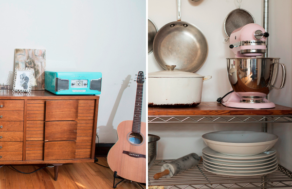
Seen in: At left, Joshua Kulp’s Lincoln Square condo; at right, Christine Cikowski’s Logan Square apartment
The design element: A turquoise record player and a pink KitchenAid stand mixer
Why it works: Stainless steel and black are ubiquitous for appliances and electronics, which means that colorful ones are all the more intriguing.
5. Don't be afraid to go big with your greenery.
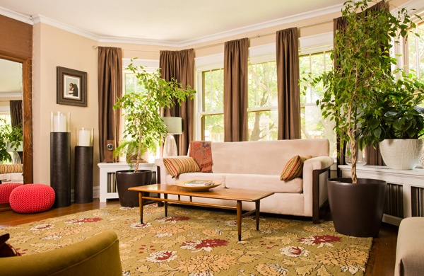
Seen in: Restaurant designer Nicole Montgomery’s Peterson Woods home
The design element: Tons of living greenery
Why it works: By framing the foliage outside the window with potted plants and a green floral rug, Nicole’s living room almost feels like a greenhouse. It’s rich and lush, despite being rooted in earth tones.
6. "Neutral" is a flexible term.
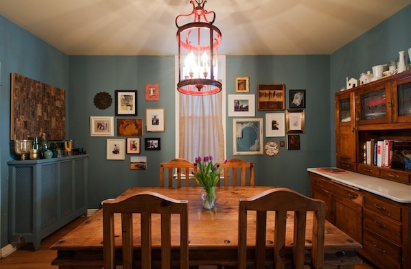
Seen in: Menswear designer Susie Sorenson’s and artist Russ White’s Humboldt Park home
The design element: Teal walls
Why it works: This shade of blue would normally be categorized as an accent color. But by painting it over the radiator cover and letting the red chandelier and white picture frames pop against it, Susie and Russ have transformed it into a “neutral.”

See more examples of inspiring interior design:
How to Make Any Home Look Like a Brownstone
Tours of Gorgeous Chicago Homes
Deals in chicago

Deals in chicago Other Deals in chicago